Pantone Colors for Autumn/Winter 2022-23
The Pantone colors for Autumn/Winter 2022 feature colors for everyone!

This post contains affiliate links. By clicking on them I may receive a small commission at no extra cost to you! As an Amazon Associate I earn from qualifying purchases. Thank you for your support!
As I sit and write this today, fall seems a very long way off in coastal Texas. The summer heat still has at least a month to scald us. But what better time to look forward to the changing leaves and pumpkin spice everything promised by Fall?
It’s not far, less than a month away. I’ve been preparing my own seasonal capsule based on wardrobe essentials and featuring hot pink and yellow as accent colors (along with leopard).
Today, though is all about the Pantone colors for autumn/winter 2022!
Table of Contents
What is Pantone?
Pantone is the foundation of cohesive color for basically any industry. They provide products and services that allow businesses and individuals to ensure that color use is consistent across mediums and platforms. That’s a lot of marketing jargon, so think of it like this:
Imagine a huge multinational company like McDonald’s. The golden arches are featured in signage, paper products, and much more. With hundreds of variations on the color “yellow” it would be impossible to match branding across all these different avenues. Pantone colors are standardized so that companies can make sure their branding is consistent, among other things.
But for little ol’ you and me, Pantone colors are most useful twice a year when they publish the upcoming seasonal trends. These colors come straight from the runway to illustrate what color trends are becoming popular.
So here are the 15 colors chosen for autumn and winter based on those trends.
Autumn/Winter Pantone Colors for 2022-23
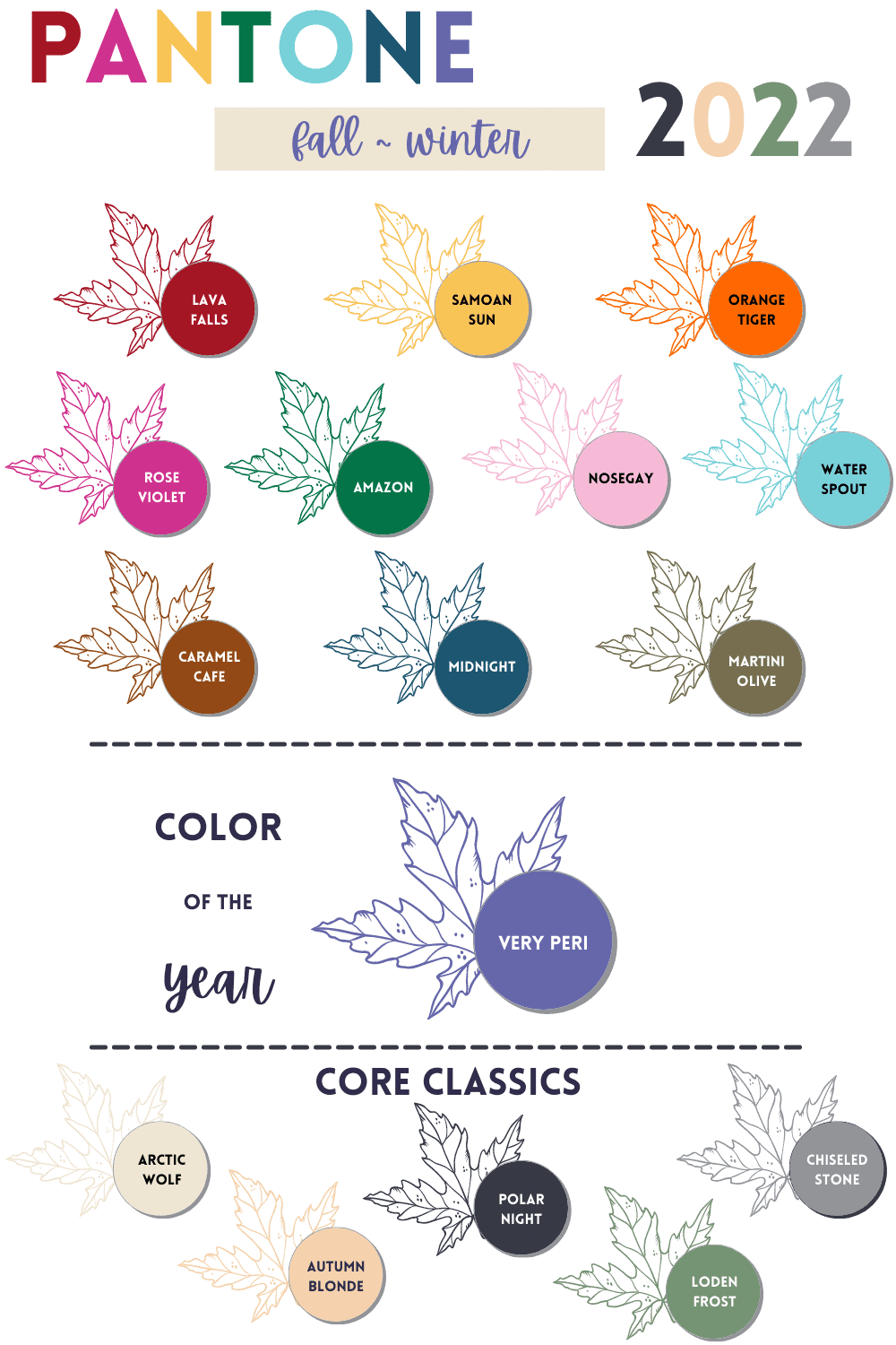
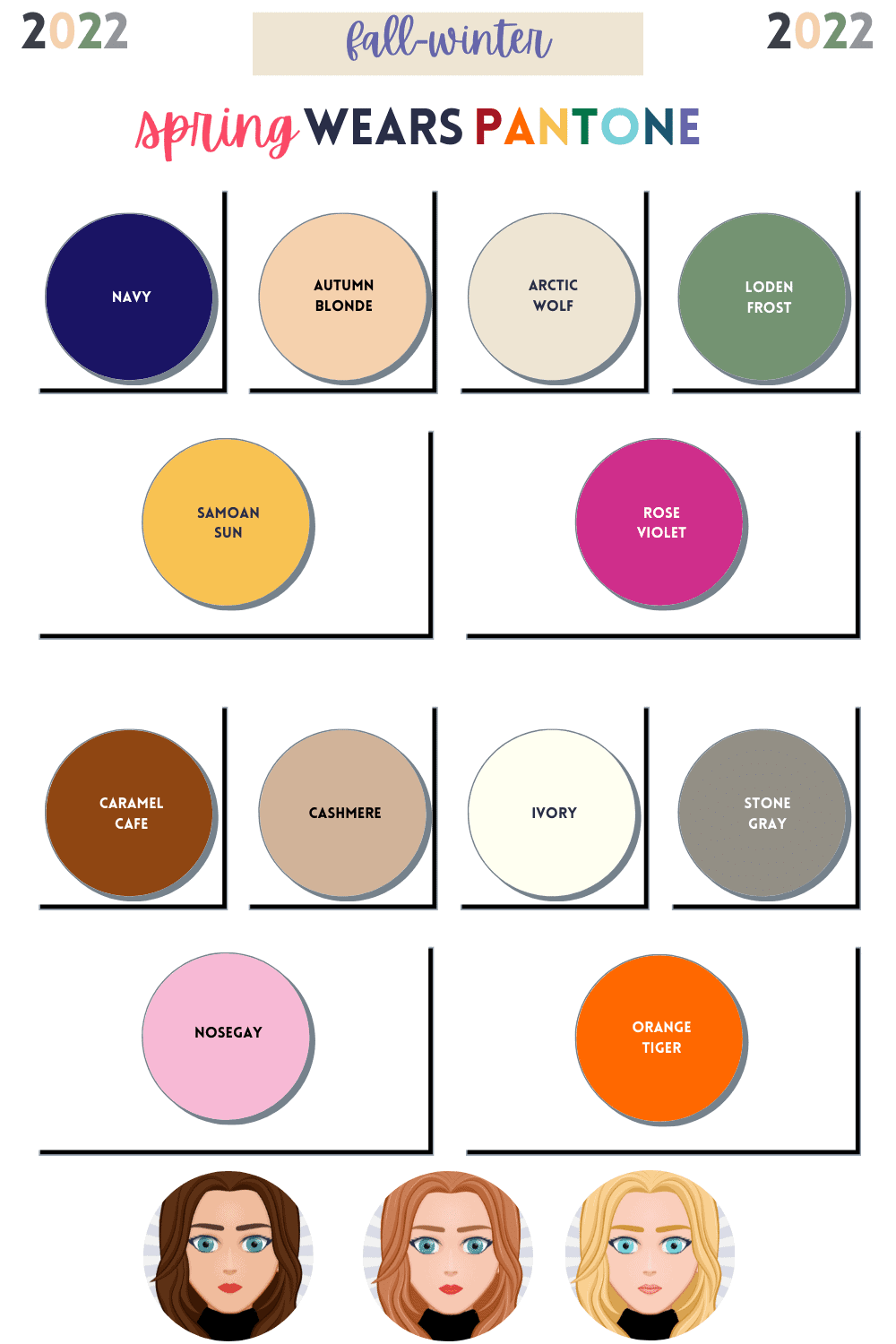
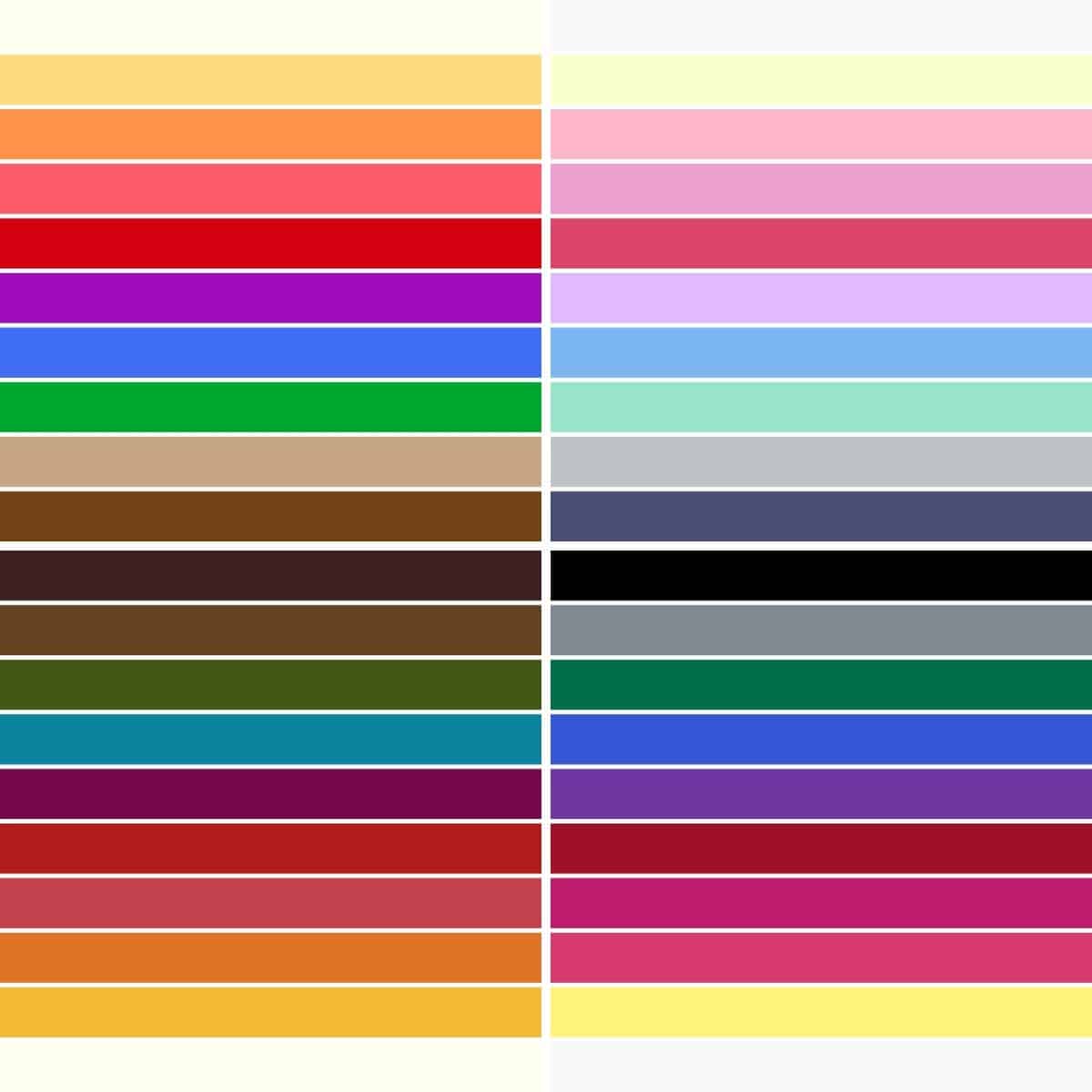
Let’s first take a look at the neutrals. Many of these are twists on commonly found colors, and if you have something similar already in your wardrobe, definitely use that as a replacement!
- Arctic Wolf – this is an off-white with a golden undertone. Probably suitable for most seasons other than true/cool winter and summer.
- Autumn Blonde – a lighter shade within the orange/camel family.
- Polar Night – a near black navy, with hints of subdued gray.
- Loden Frost – similar to a deep sage, slightly cool as a neutral. Perfect for all but warm autumn and the clear seasons.
- Chiseled Stone – a medium blue-based gray.
The following are the 11 colors of Autumn/Winter, and I couldn’t love them more! Some are suitable for different seasons, and I’ll note that below. Quoted descriptions are taken directly from Pantone.
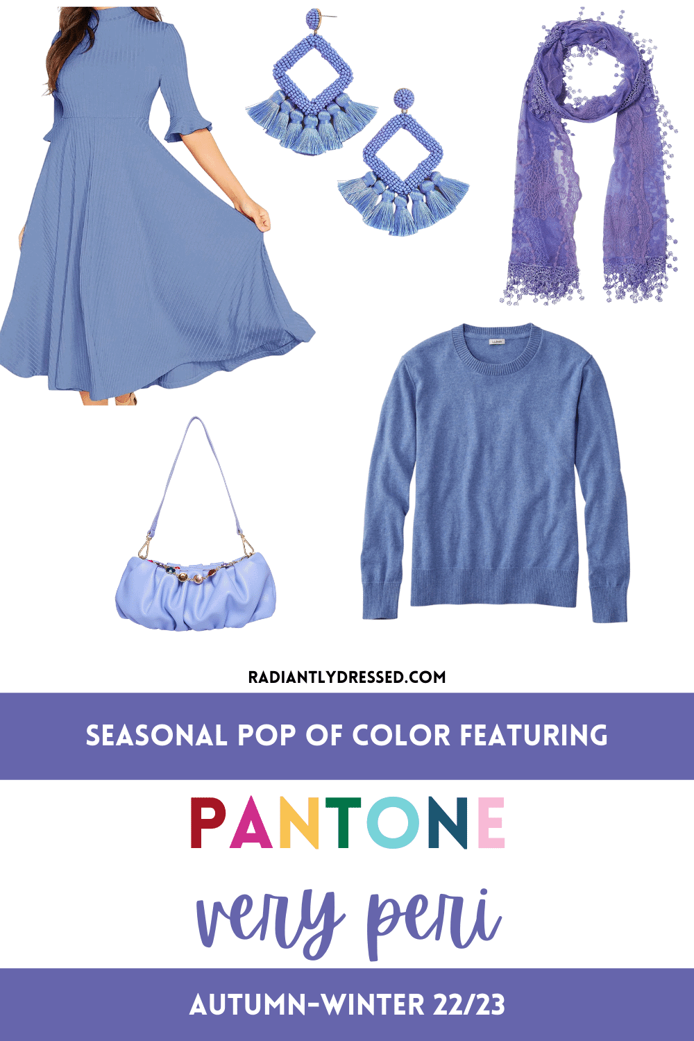
Pantone Very Peri
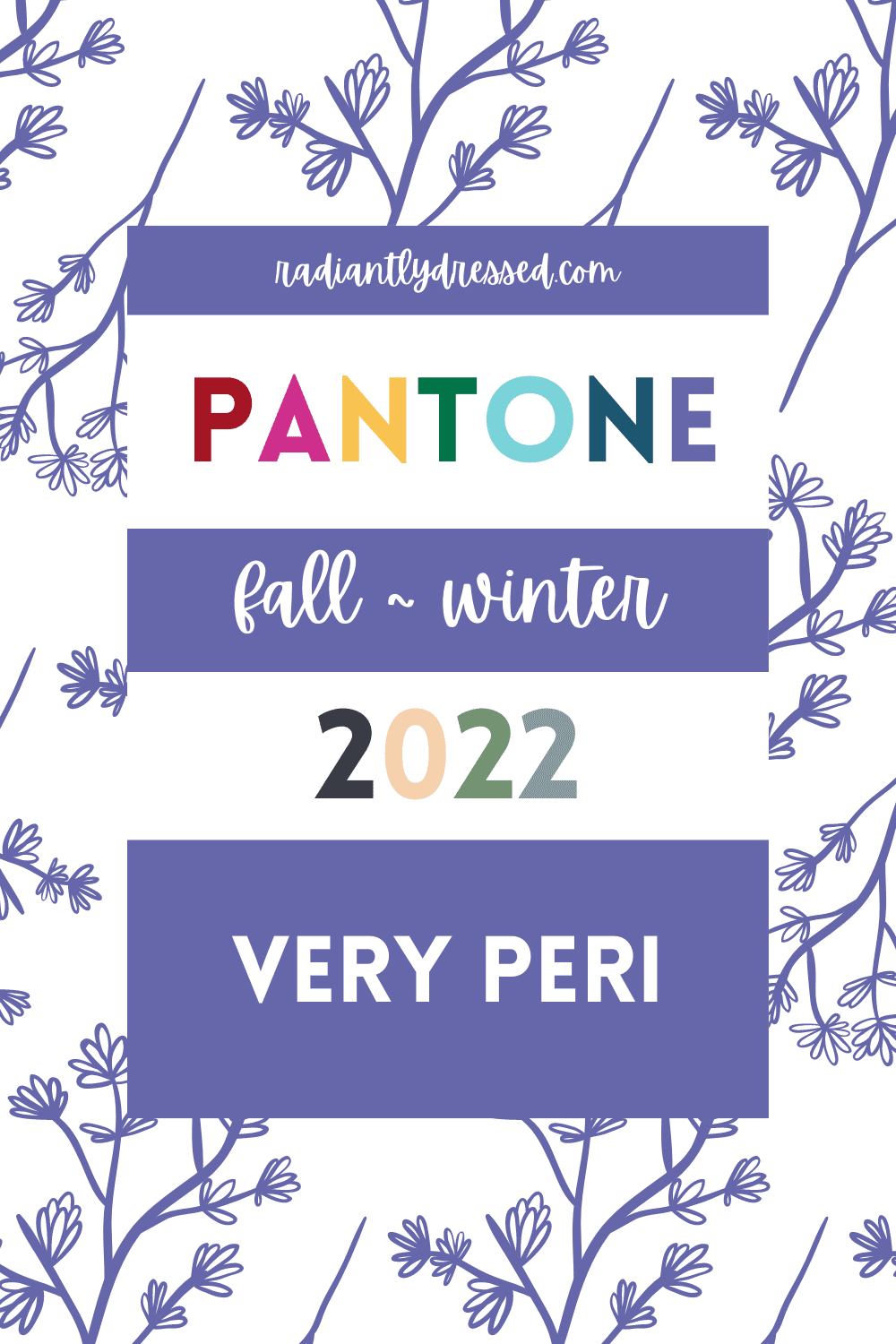
Very Peri is “a warm and friendly blue hue with a carefree confidence and joyful attitude, emboldens uninhibited expression and experimentation” This is designated as the Pantone color of the year. This is a blue-based purple that is best reserved for the cool seasons. Cool winter, soft autumn and all the summer seasons can wear this near the face, but the others should keep to the bottom half or accessories.
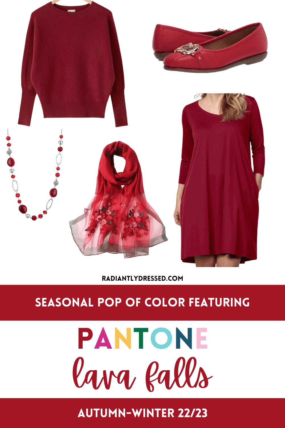
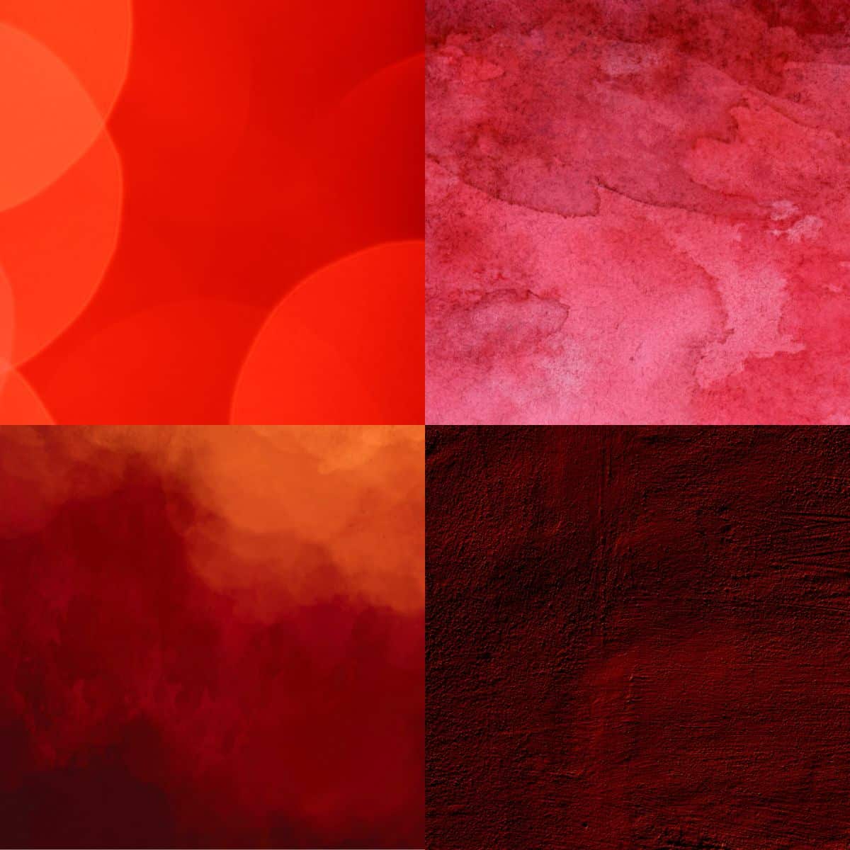
Pantone Lava Falls
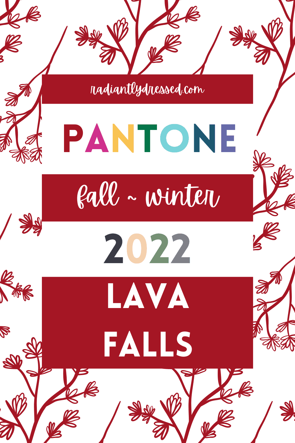
“An impassioned orange-red with a captivating presence.” Lava Falls is a deep warm red with deep value perfect for autumn and winter.
Red can be a difficult color to wear with its many variations, but this one should be ok for almost all but the light seasons.
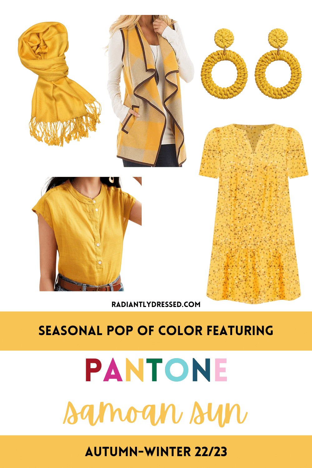
Pantone Samoan Sun
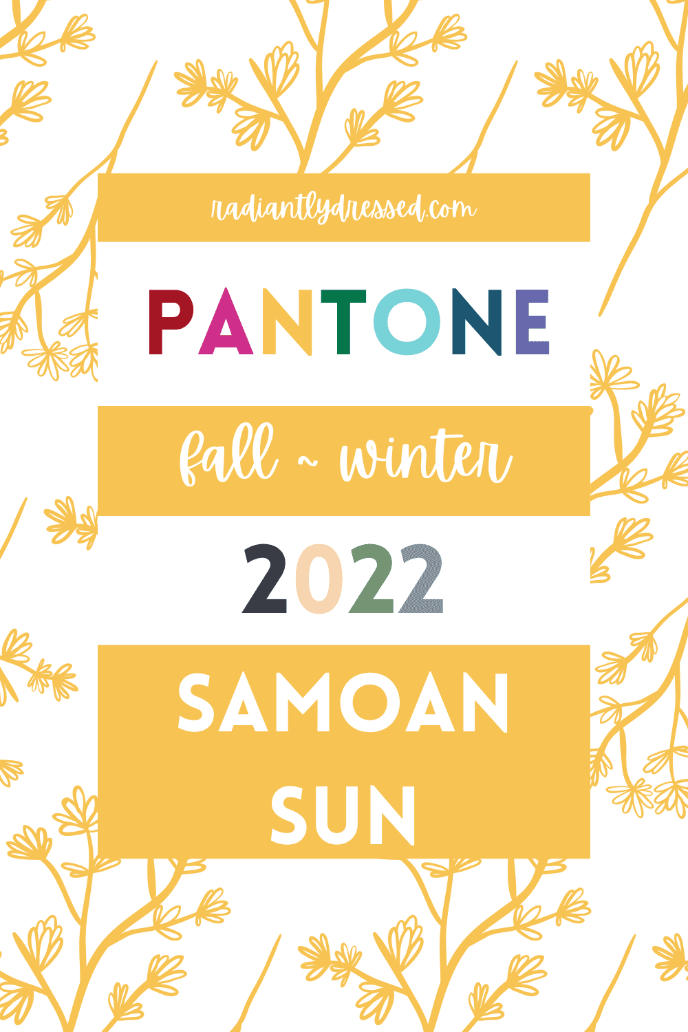
Pantone says this “cheerful Samoan Sun enlightens and illuminates.”
This is a really fun golden yellow perfect for fall.
It leans a bit towards orange, hence the marigold/sunflower tone, and is not muted.
Spring and Autumn should have fun with this one, along with the neutral seasons of clear winter, deep winter, and possibly soft summer.
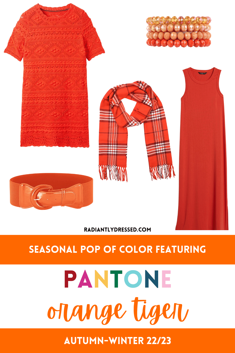
Pantone Orange Tiger
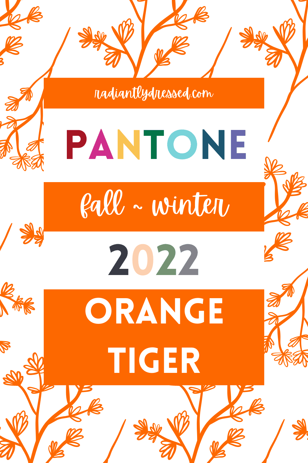
Pantone describes this orange as a “high vis orange with whimsicality.”
Although this color is warm enough for fall, it’s strong color and chroma is going to make it difficult for many to wear.
If you really love orange try it in an accessory far from your face. Unless you are warm spring or warm autumn, then go wild!
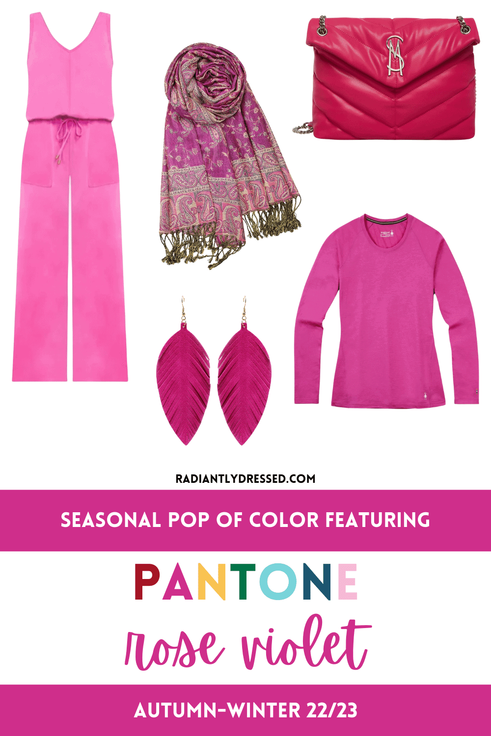
Pantone Rose Violet
This is supposed to be the hottest color of the fall, and Pantone calls it “vivid and vibrant…full of zing.”
Rose Violet is a bold pink, purely saturated with purple undertones.
The cool seasons will be happy to see this as a trending color, and some of the springs will enjoy it as well.
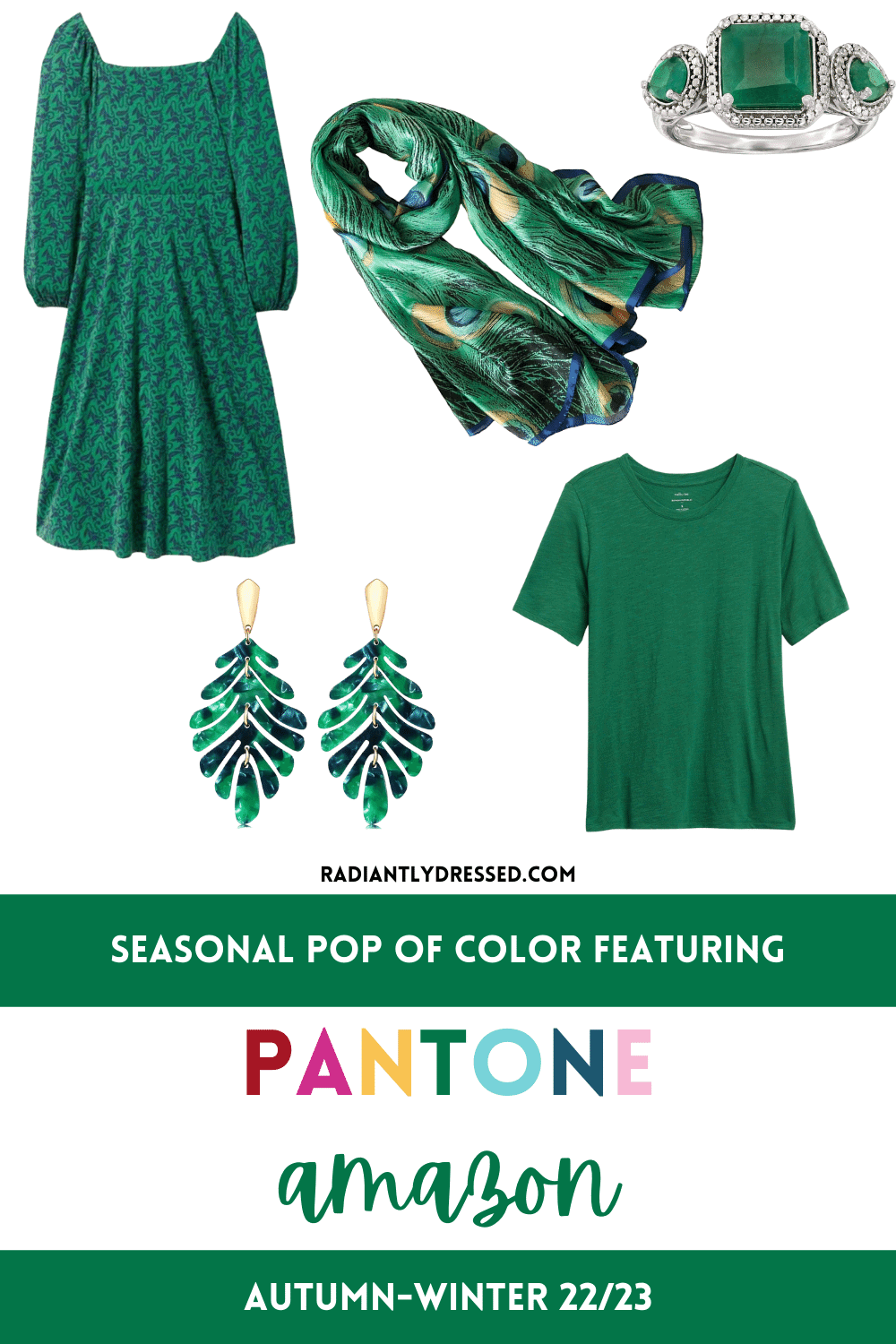
Pantone Amazon
“Amazon is a lush and fertile broadleaf green.” Here is another saturated color featuring in fall.
This green is fairly neutral, leaning ever slightly towards blue, so officially neutral-cool.
It will be a great color for most seasons.
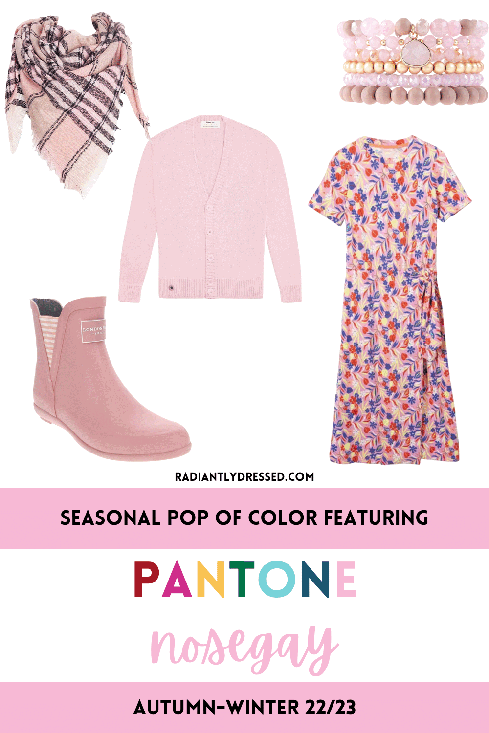
Pantone Nosegay
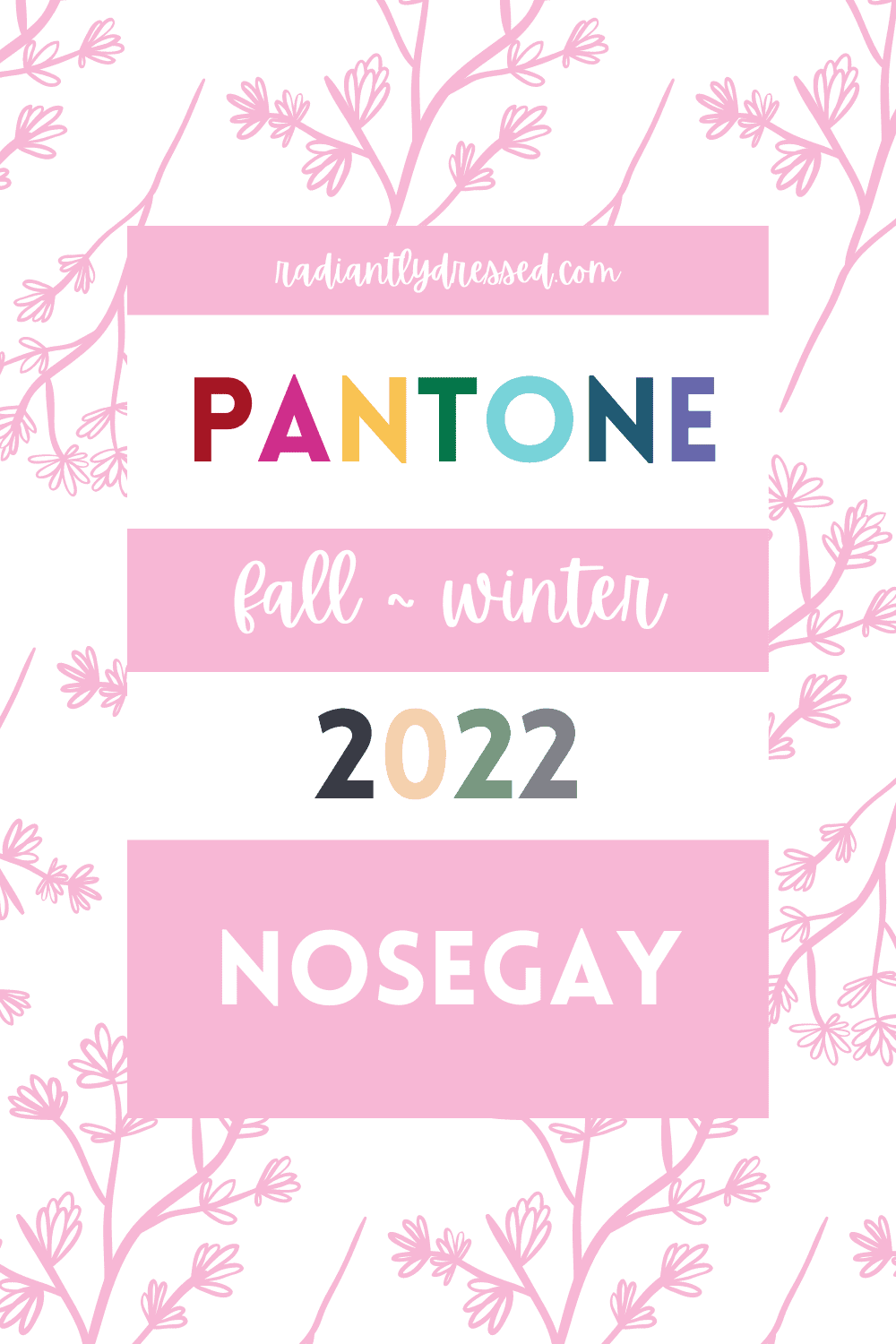
Here is another pink, “a fragrant floral pink that envelops the senses.”
I’m not going to pretend that this color isn’t more suited to the cherry blossoms of spring, especially as it’s quite similar. This pink is also cool-neutral, not quite pastel but light.
Cool winter and light spring, along with the summer seasons will wear this well. For everyone else, small accents away from the face.
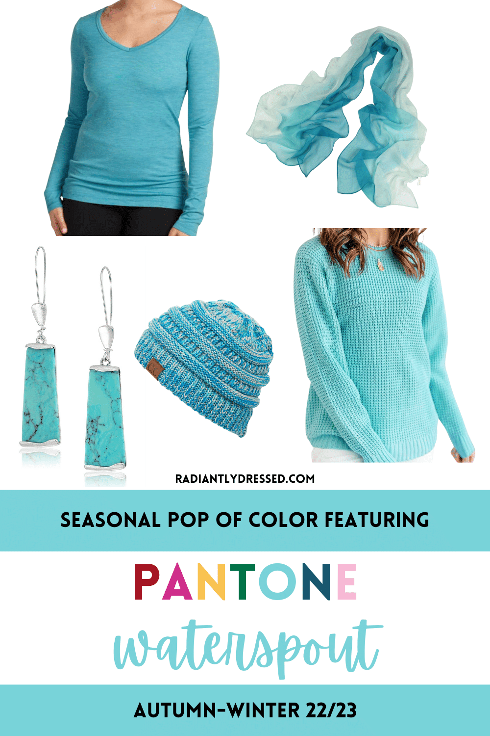
Pantone Waterspout
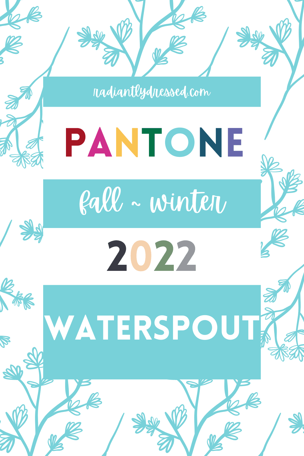
Pantone says that “cleansing waterspout cools and refreshes.” This blue is definitely reminiscent of spring and summer in it’s freshness.
Waterspout is a lighter turquoise color, slightly more green that blue.
Fitting the definition of teal, which is a universal color, waterspout should work well for many types. Deep Autumn and Deep Winter may find it too light.
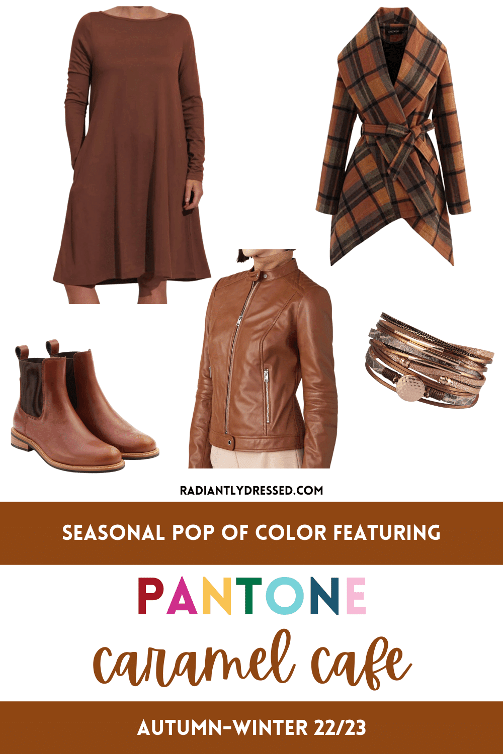
Pantone Caramel Cafe
Caramel Cafe is a “delicious brown hue that tastefully tempts.”
Finally we see a color that feels very autumnal. This shade reminds me a deep cognac.
Indeed this color is a darker orange, slightly darker than cognac.
This is a great color to incorporate in leather accent goods such as boots, bags, or belts. As long as it’s worn away from the face it will work for all seasons.
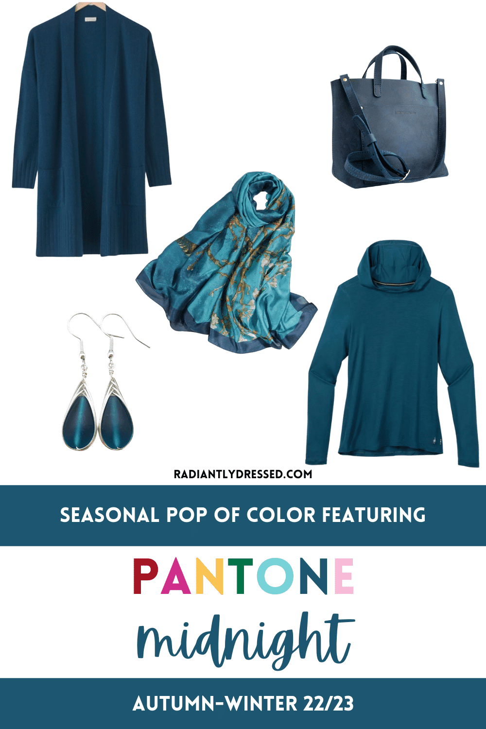
Pantone Midnight
Midnight is a described as a “hypnotic deep blue evocative of the evening sky.”
This is truly a great color, close enough to navy to work for most, but slightly more interesting.
This is a dark blue with just a hint of green. Light and soft seasons can use it like a neutral, and others can use it for a refreshing calming pop of blue.
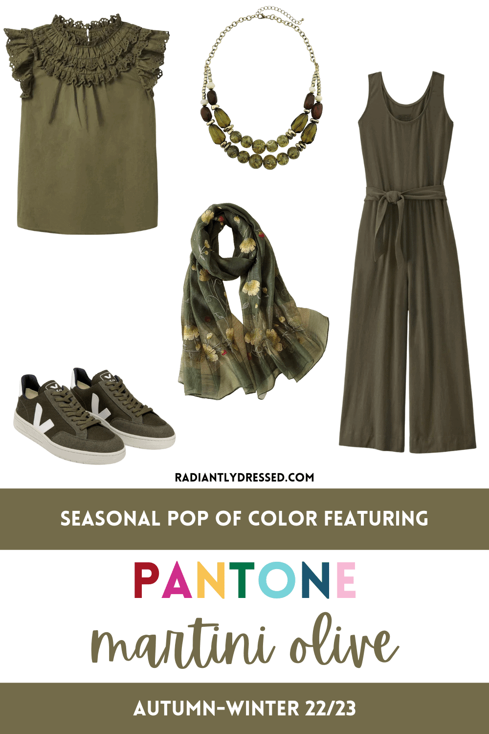
Pantone Martini Olive
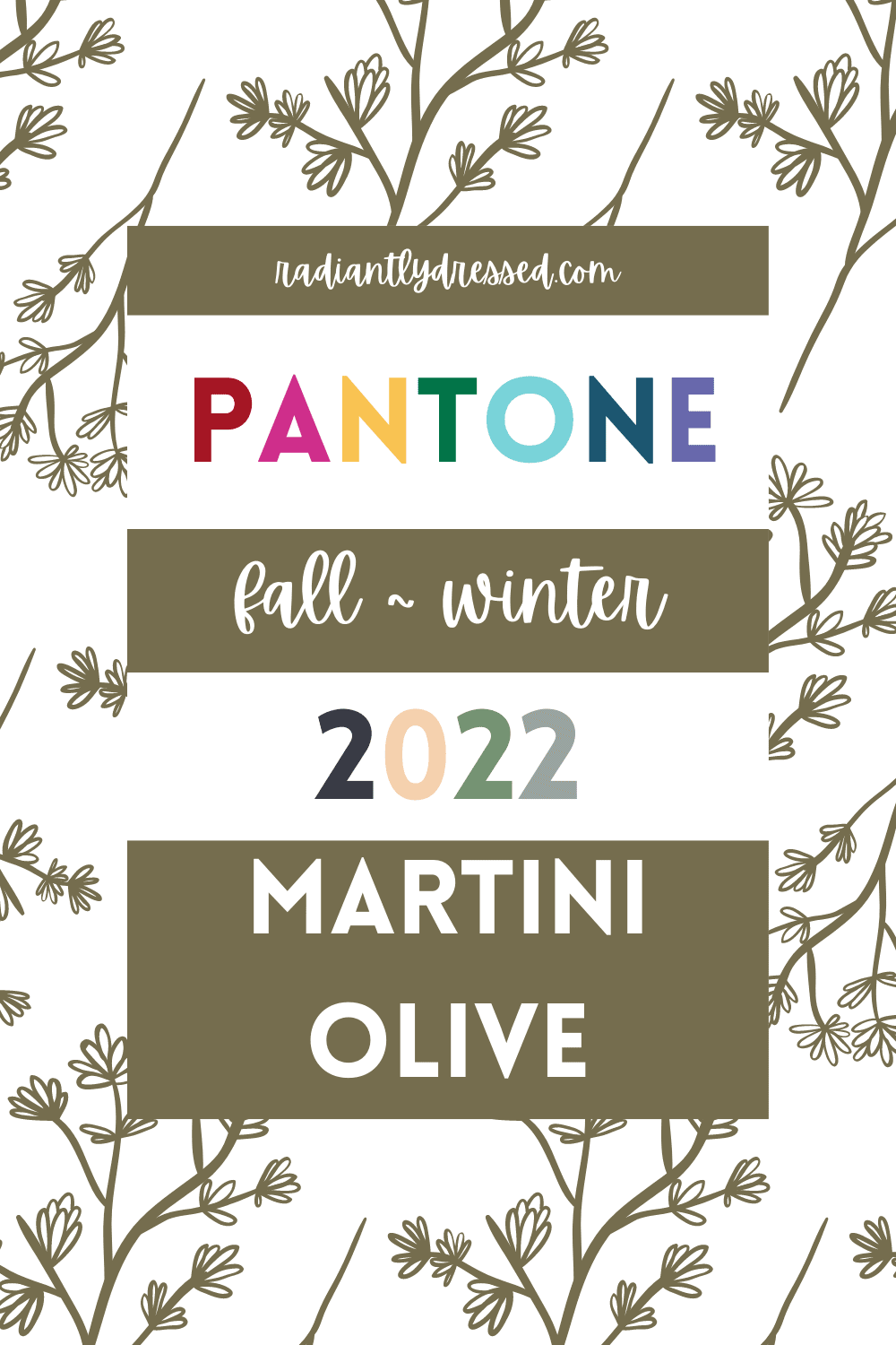
Pantone calls Martini Olive a “fruit inspired green tone with a touch of brine.”
Indeed this olive does have a bit of brown bite. In color terms it’s actually a dark muted yellow sitting near orange.
Olive makes a great “color neutral” for many people, especially the warmer and darker seasons.
Cool Winter and Cool Summer should avoid this, along with Bright Winter and Bright Spring.
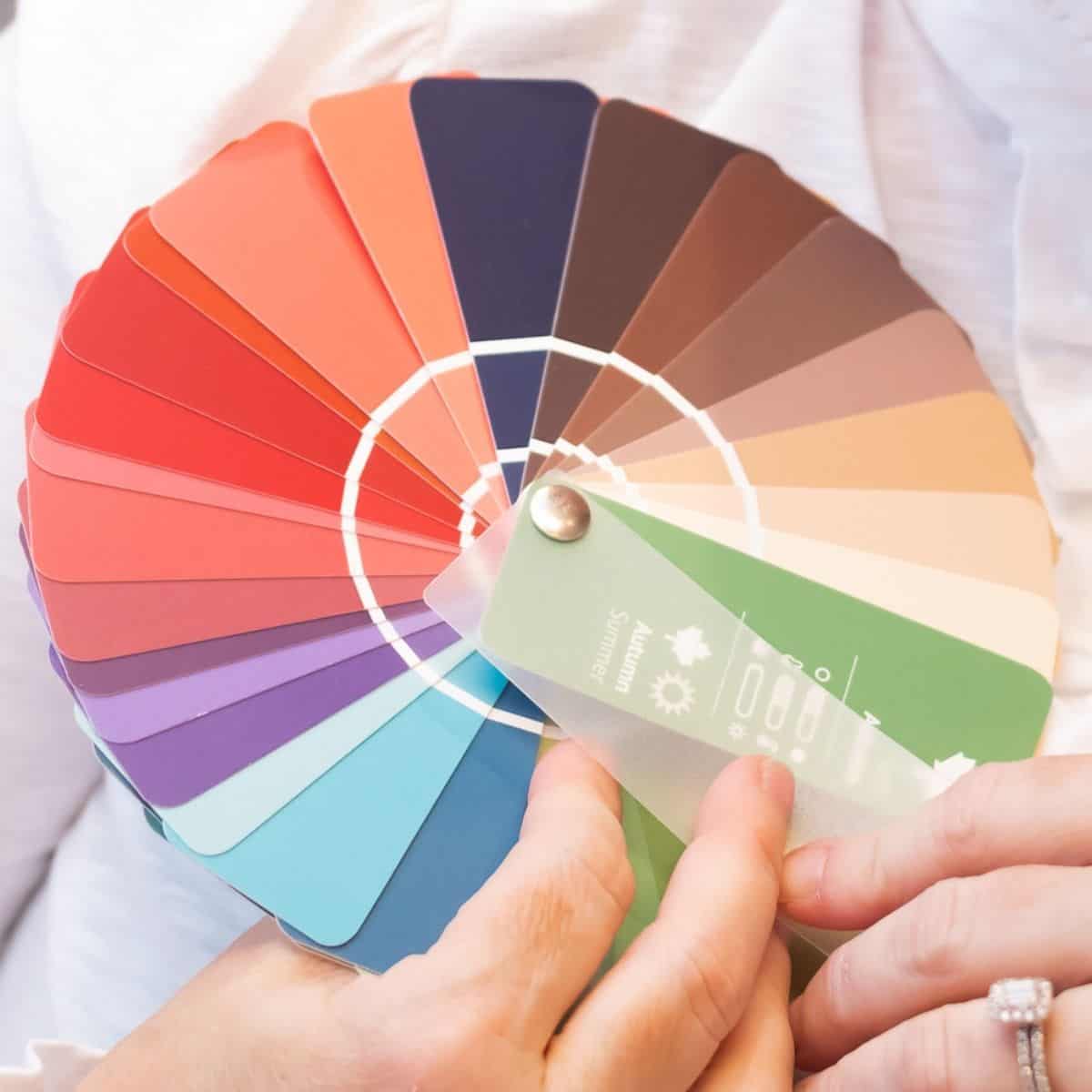
Pantone Autumn/Winter Colors for Seasonal Color Analysis
Let’s take a look now at how each of the four seasons could incorporate these trending colors into their wardrobes.
Spring
The spring seasons do best in colors that are light to medium in value, warm and fairly bright. Autumn blonde, arctic wolf, caramel cafe, and loden frost would incorporate well as neutrals, while samoan sun and rose violet would make a great duo, along with nosegay and orange tiger.
Summer
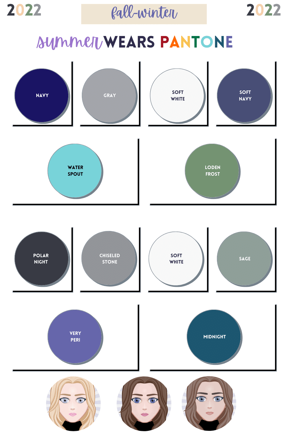
Summer seasons do well in colors that are light to medium dark in value, cool in hue, and somewhat muted. Polar night and chiseled stone would make great neutrals. Dreamy duos include water spout and loden frost, or very peri and midnight.
Autumn
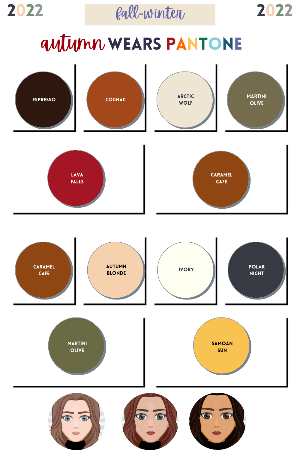
Autumn looks best in colors that are medium to dark in value, warm in hue, and muted. The Pantone autumn/winter neutrals favor warm seasons, such as arctic wold, caramel cafe, autumn blonde, and polar night. Lava falls and caramel cafe make a great duo, along with martini olive and samoan sun.
Winter
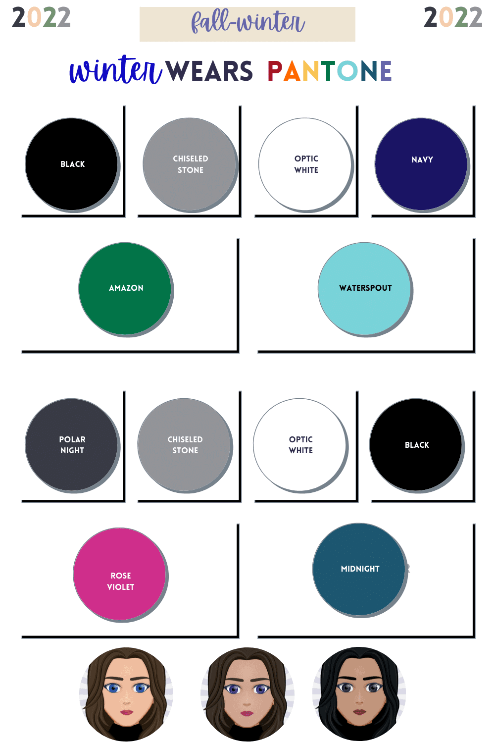
Winter needs colors that are medium to dark, slightly to very bright, and cool in hue. Chiseled stone and polar night are good neutrals for winter seasons. The boldest Pantone colors are good duos for winter, amazon and waterspout, or rose violet and midnight.
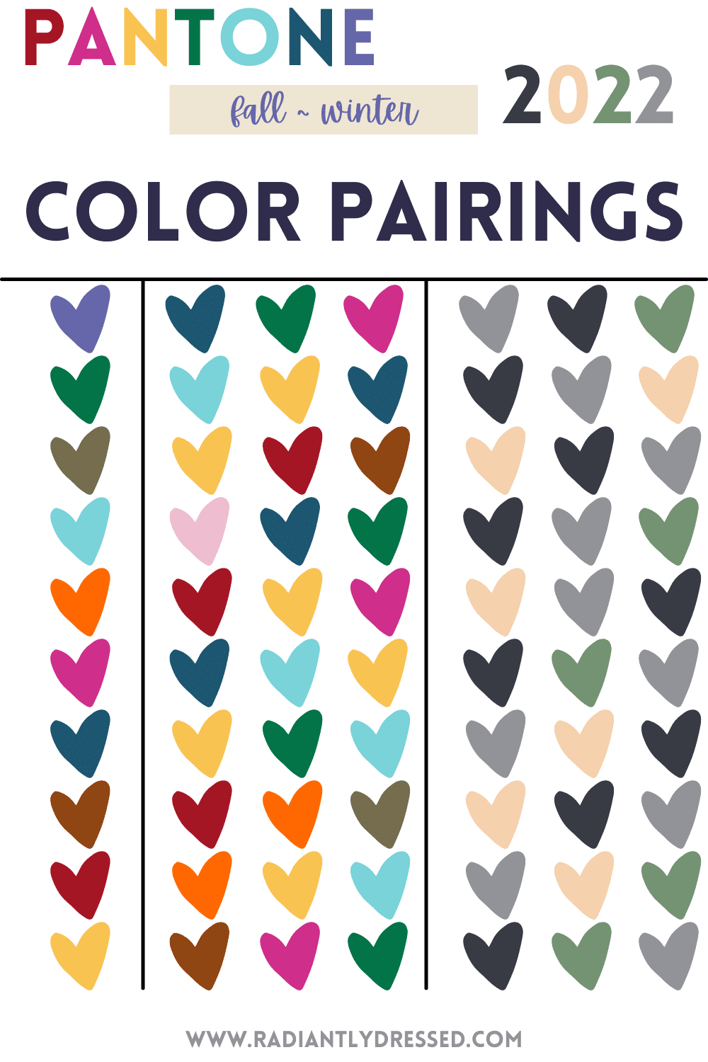
If you’re not feeling any of these choices, take a look at the best combinations for each Pantone Autumn/Winter color.
Get Trendy with Pantone
Did you know the easiest way to look fresh and current without buying into style trends is to adopt a few seasonal colors into your wardrobe?
Below you’ll find items currently available that match the Pantone Colors for Autumn/Winter 2021.
Final Thoughts on Pantone Autumn/Winter Colors
As a style blogger adopting a less is more mentality, there’s a balance between timeless classics and trends.
Incorporating trending colors in inexpensive styles is a great way to feel current.
Are you still struggling to create a cohesive color palette for your minimalist/capsule wardrobe? Check out this awesome resource to get you started.
Related Color Articles:
- 3 Benefits of a Color Palette
- What Are My Best Colors?
- Eye Patterns and Color Analysis
- Explore the 12 Seasons of Color Analysis
Which color are YOU most excited about? Are any of these pieces dying to jump in your closet?
Tell me in the comments!
Update your fall closet with trending Pantone colors for autumn/winter 2022.
Stacey is the owner and creator behind Radiantly Dressed. She is a certified image consultant and AICI member focusing on creating simplicity in wardrobes via color and style.

Great post! It was really well thought out. I love these colours. The raspberry sorbet is so fun.
Thank you! I also love the raspberry sorbet!
Thanks for taking the time to share all this great info! I’m excited to find some marigold!
Let me know when you do! It was the hardest color to find!
Love this article! You’re always so in depth and providing excellent examples! I love the peri color but not sure how to incorporate it as my season color is deep autumn. Love to get your thoughts!
Ooh that’s a tough combo with Deep Autumn. It could pair well with some of the deeper greens a nod to a cooler palette. Maybe grab a small acccessory: purse, scarf, earrings, etc and wear it with dark green or deep teal 🙂 It would look great with burgundy too!