Warm Spring: Color Palette, Capsule Wardrobe, and Ultimate Guide
Warm spring is warm and light and shares characteristics with spring and autumn in the 12-season system of color analysis.
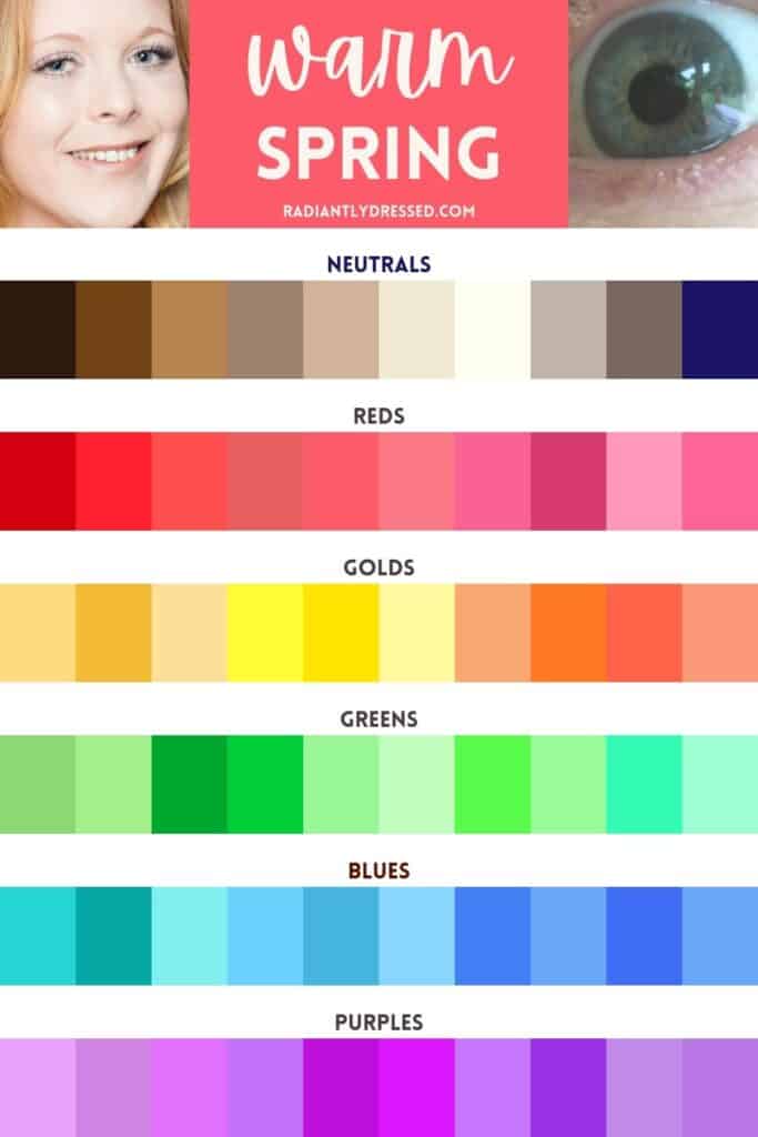
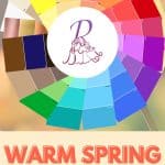
The warm spring color palette is a vibrant and inviting selection of hues that enhances your natural coloring if you fall into this seasonal category. Characterized by warm undertones and reminiscent of the fresh, blooming beauty of spring, these colors complement individuals with a warm spring complexion.
Are ALL your features brilliantly warm? Are you drawn to true orange and yellow? Do you love the colors of spring flowers?
If this sounds like you, you might be a Warm Spring!
This is a comprehensive guide to warm spring in the 12-season system of color analysis. Keep reading to learn the physical characteristics, the best makeup, a beautiful color palette to wear, wardrobe staples, and how to create your own custom palette.
Table of Contents
The 12 Seasons of Color Analysis
Seasonal color analysis offers a transformative way to discover colors that not only enhance your appearance but also boost your confidence. By carefully examining your skin’s undertones, eye color, and hair shade, this method categorizes you into one of twelve unique color families.
The result? A carefully chosen palette of colors that bring out your natural beauty and give you a boost of confidence.
In this system, six key color components serve as the foundation: warm, cool, deep, light, soft, and bright. Within the warm spectrum, the Spring color family stands out for its light to medium, bright tones.
The spring color family includes clear spring, warm spring, and light spring.
- Clear Spring
- Warm Spring (you are here)
- Light Spring
Today, we’re exploring the vibrant allure of Warm Spring—a palette that perfectly blends warm undertones with lively hues.
This site contains affiliate links. As an Amazon associate I earn from qualifying purchases. Thank you for your support!
Warm Spring is Warm and Leans Light
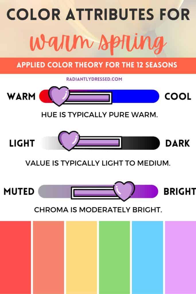
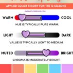
Warm Spring is classified in the following ways: warm hue, light value, bright chroma.
- Warm hue – the undertone is always red, and typically has warm overtones as well such as yellow or beige.
- Light value – warm spring is typically light to medium in value. These individuals tend to favor those colors right in the middle, leaning towards lighter shades.
- Bright chroma – warm spring is quite bright, like the expression of primary colors in their level of saturation.
Want to save these graphics for quick access later?
Download the Warm Spring Starter Kit to get the color images featured in this post. You’ll also get a bonus FREE color palette template to make your own colorful closet plan.
Warm spring is one of the pure seasons, and as such all the features are warm. It is distinguished from the other true warm season of autumn in value and chroma, with warm spring leaning both light and bright.
Warm Spring skin typically features soft porcelain beige or creamy peach tones, often with a warm, golden undertone that gives a radiant, sun-kissed glow. This skin type tends to have a natural warmth, making it look fresh and vibrant, perfectly complemented by the bright and lively colors of the Warm Spring palette.
Warm Spring eyes are typically amber, green, or blue and are quite brilliant. They may feature a green floral ring or brown freckles as part of their unique pattern, adding depth and sparkle to their vibrant appearance.
Warm Spring hair usually belongs to the blonde color family, varying from light to medium/dark shades. It often includes warm red or strawberry tones, adding a sun-kissed glow that harmonizes beautifully with the bright and lively colors of the Warm Spring palette.
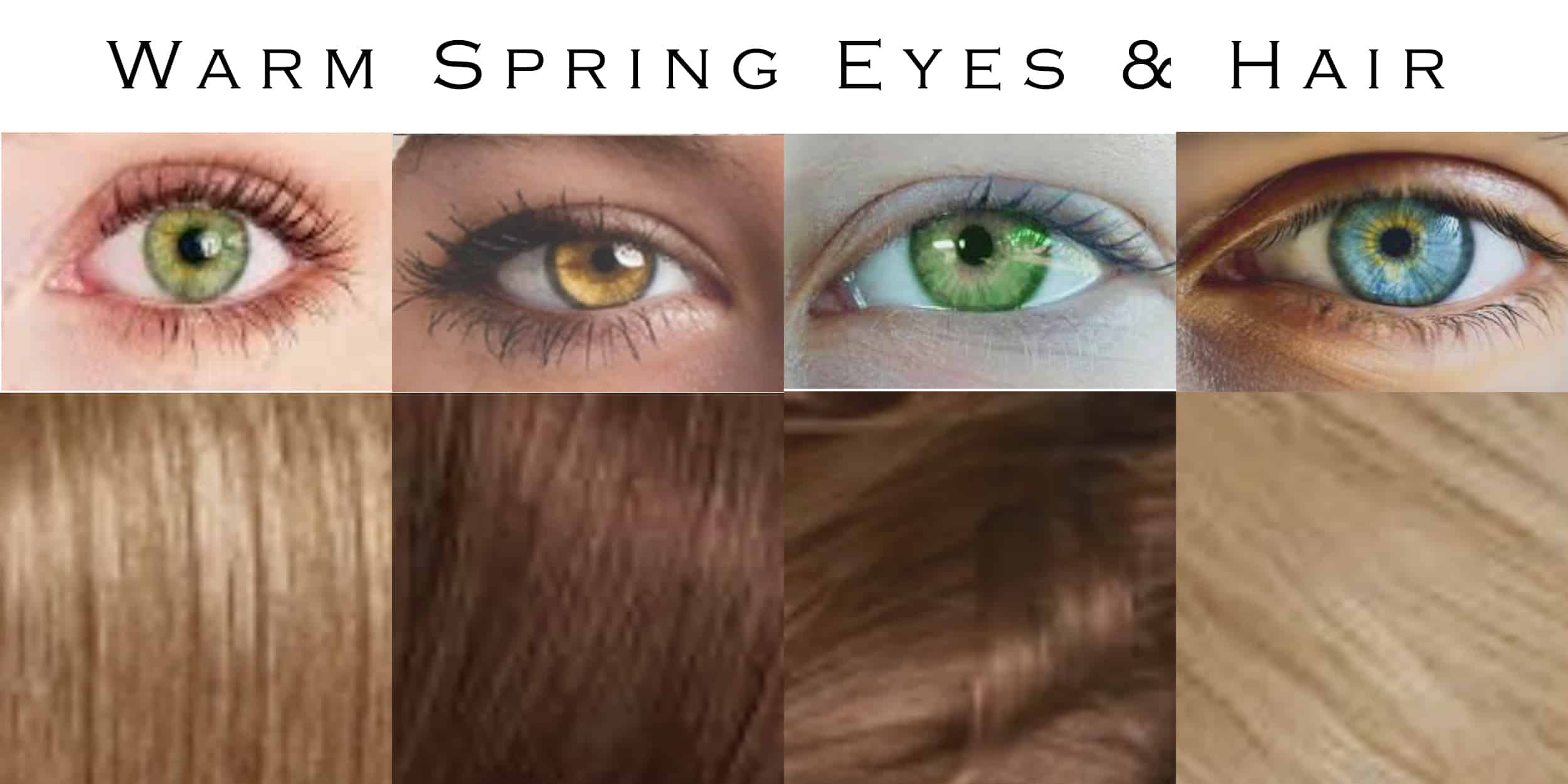
The features exhibit a moderate degree of contrast along the medium value spectrum. All the features are quite bright, with the eyes and hair being noticeable against creamy skin.
Makeup for the Warm Spring Woman
To emphasize the features of warm spring, makeup colors should be both warm and bright as well.
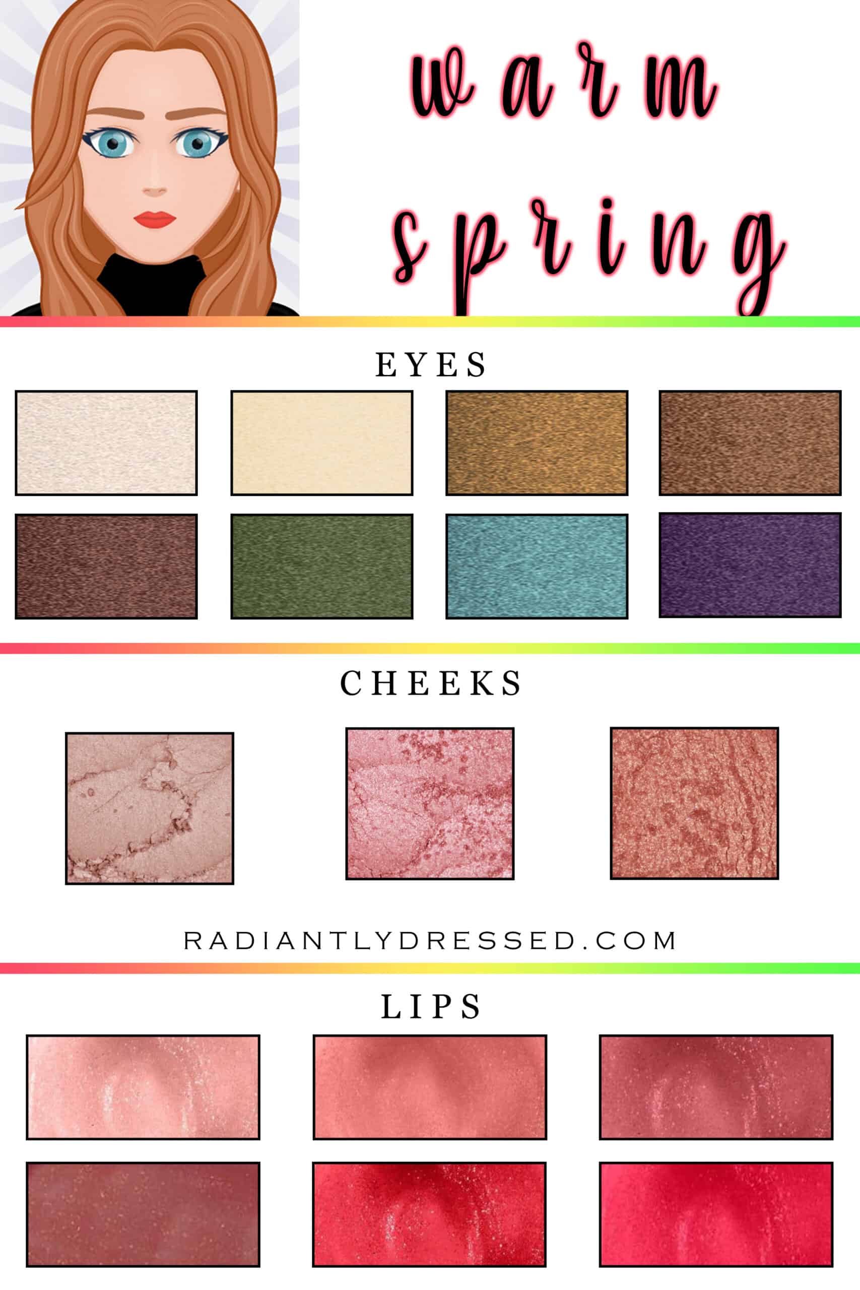
For the eyes, choose light neutrals such as cream, butter, and bronze, or darker colors like copper, redwood, and olive. Accent colors could be warm teal or purple.
For the cheeks, neutral warm shades of sand, coral, and copper are wonderful to bring out a peachy glow for warm spring.
Nude lips are a winner for warm spring, along with caramel and toffee. For a bold lip choose raisin, coral red, or cherry red.
Avoid cool tones like pink or berry red lipstick, cool blue and green eyeshadows, and soft pink cheek colors. Warm spring should also stay away from dark brown lip colors.
Inspiration: The Vivid Beauty of Warm Spring
Warm autumn stands out for its bright warm primary colors. Think of the color of new flowers on the ground after the barrenness of winter. Since it’s in the warm color family, it’s heavy with reds, oranges, yellows, and greens.
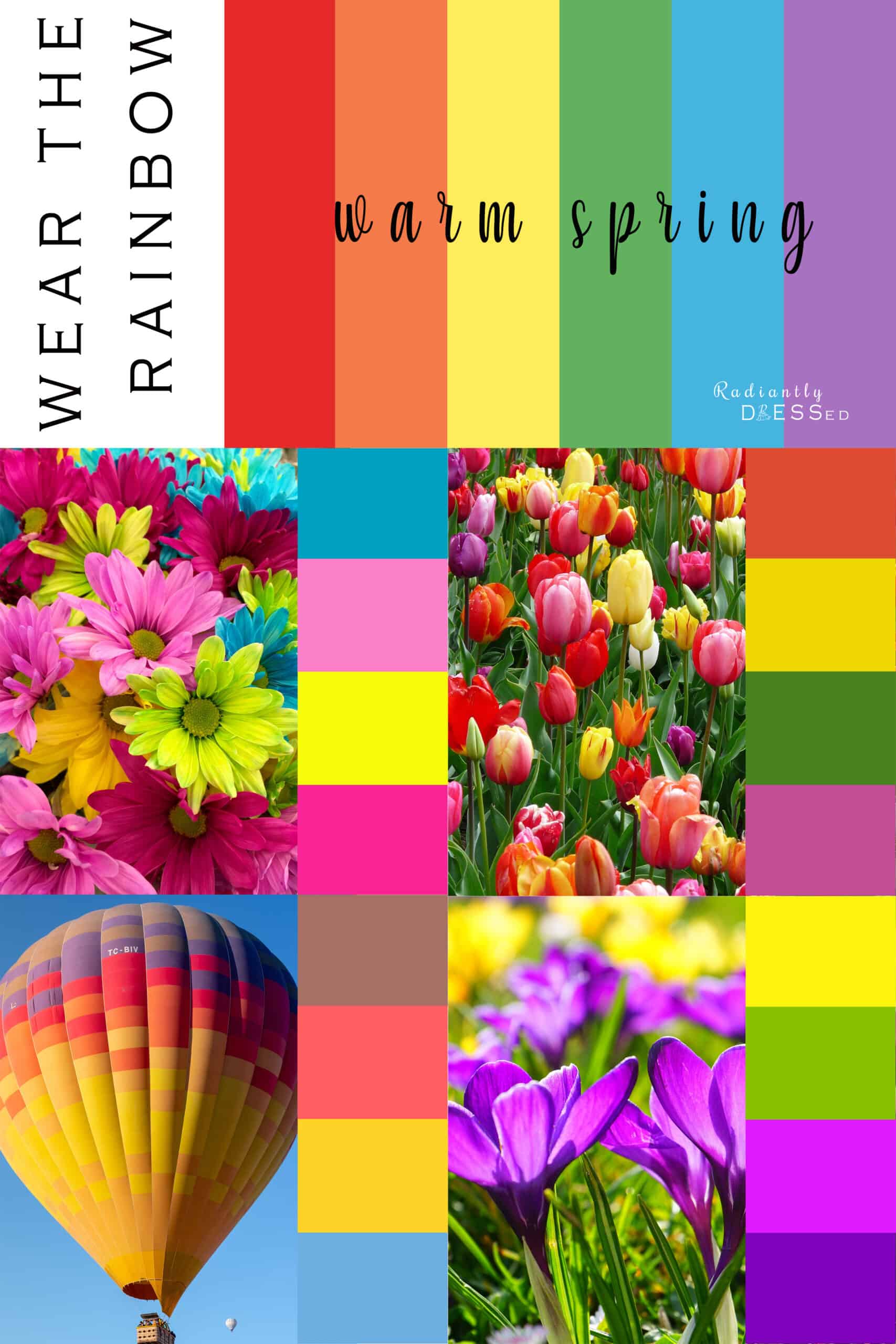
Visual Inspirations
Here, we explore various natural elements that embody the Warm Spring palette. The traditional 6-color rainbow represents the purest, most neutral hues, but the Warm Spring rainbow offers warmer, clearer versions of these colors.
Colorful daisies with their neon hues showcase the vibrant range of Warm Spring shades. A field of tulips illustrates the primary colors in their warmest tones, while a hot air balloon against the sky highlights the bright and lively shades typical of Warm Spring.
Finally, bold purple and yellow flowers complete the spectrum, emphasizing the rich and sunny essence of the Warm Spring palette.
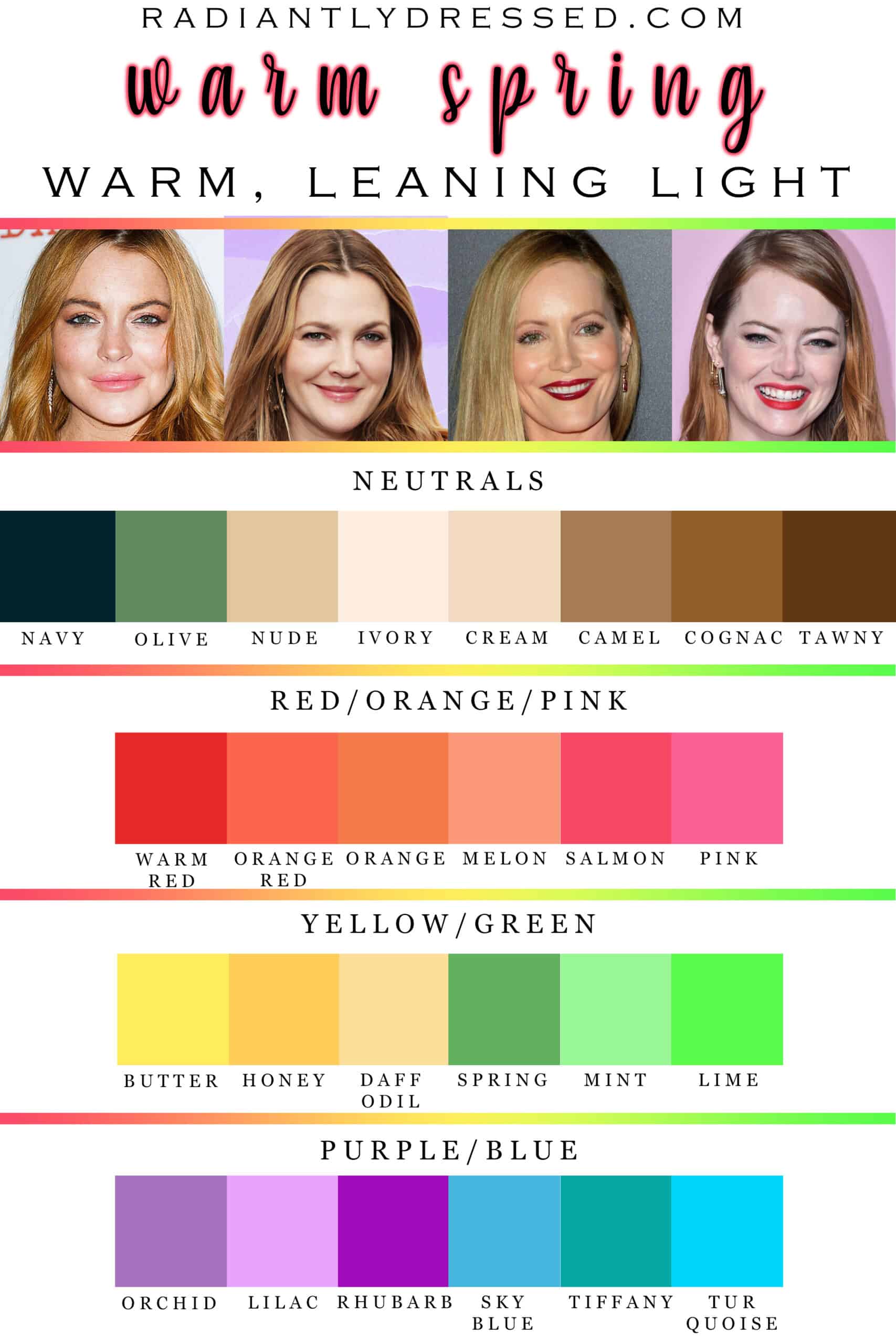
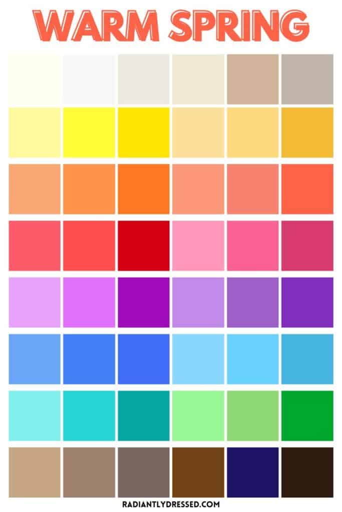
Warm Spring Color Palette
Want to save these graphics for quick access later?
Download the Warm Spring Starter Kit to get the color images featured in this post. You’ll also get a bonus FREE color palette template to make your own colorful closet plan.
In creating a palette for warm spring we start with neutrals, and work through the major color families.
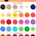
Black and white are out for all spring types with brown and navy taking the place of black, and ivory functioning as white. Olive, nude, and camel are colored neutrals that will be staples in the warm spring wardrobe.
Warm and orange-red and great bold tones, and warm spring looks great in oranges and many pinks. Yellows appear as butter, honey, and daffodil. Many greens can be worn along the medium to light spectrum. Blues with a bit of green are power colors for warm spring. Luxurious red-toned purples complete the palette.
There is usually a version of every color that can be worn by any season, but some may be more difficult to match and find. Many colors available may be too muted for the warm spring type, and finding primary-type colors should be the goal.
There are some colors that warm spring should always avoid. Black and white have been mentioned as they are too stark for warm spring. Soft muted colors are not suitable for warm spring as they will clash with your features. Light, bright colors, especially lime and orange, are some of the best colors for warm spring.
Choosing Prints for Warm Spring
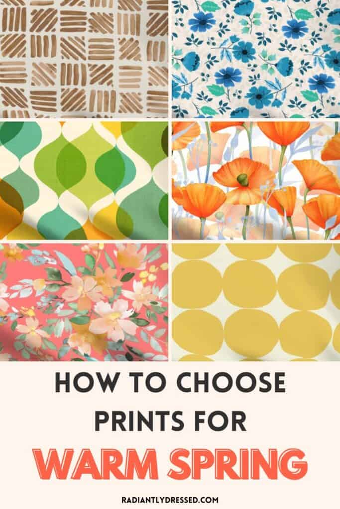
Choosing the right patterns can significantly enhance your Warm Spring style. Your patterns should harmonize with your lively color palette and align with your scale and contrast levels to highlight your features in the most flattering way. Here’s how to get it just right:
- Color Consistency: Ensure that less than 10% of the colors in your print fall outside your Warm Spring palette. This maintains a cohesive and harmonious appearance.
- Scale: Opt for medium scale prints. Your shapes shoudl be in the middle, neither too large nor small.
- Contrast Level: Stick with medium to high contrast prints. Warm spring is fairly bright and can handle brightly contrasted colors.
Following these tips will elevate your Warm Spring wardrobe and boost your confidence in selecting patterns. Below, you’ll find a collection of curated images that perfectly illustrate these guidelines.
Wardrobe Essentials for Warm, Leaning Light Coloring
No matter your style or personal aesthetic, there are a few items that every woman should have in their wardrobe.
The basics of any wardrobe should be neutrals, and you could certainly stick with all neutrals. Layering similar shades of the same color will create a rich luxe look.
For those that enjoy a more colorful look, the basics are still appropriate, but fun and funky accessories in the yellow, orange, green, and pink families will add interest.
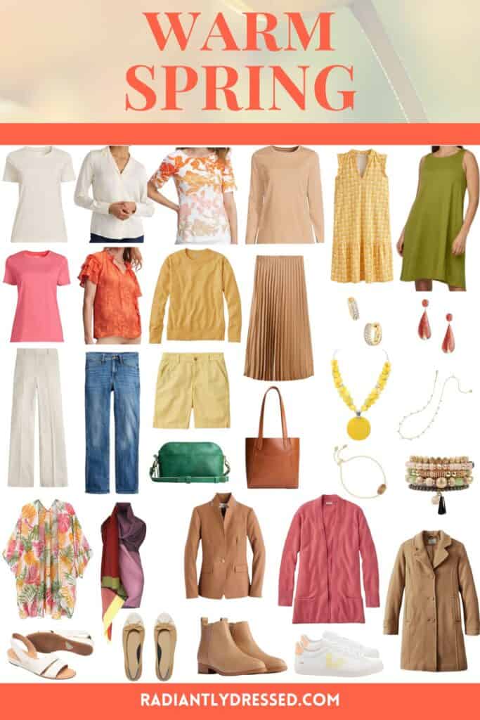
Click here to shop the Warm Spring wardrobe essentials.
Frequently Asked Questions about Warm Spring
What is the difference between true spring and warm spring?
True spring and warm spring are nearly interchangeable. True spring is a carryover from the 4 season system, and is noted as being warm and light. Warm spring is a part of the flow system, and borrows some richness from it’s secondary season of warm autumn. Many of the colors will work for both seasons.
Can warm spring wear gray?
Gray can be tricky for Warm Springs since most grays have cool undertones. However, Warm Springs can wear warmer shades of gray, such as taupe or greige (a blend of gray and beige). These warmer grays will complement the warm undertones of a Warm Spring palette better than cool, steely grays.
Can warm spring wear navy?
Yes, Warm Springs can wear navy, but it should be a warmer, brighter navy with a slight hint of green or a rich, deep blue. Avoid navy shades that are too dark or have strong cool undertones, as these can be too harsh against the warm, vibrant complexion of a Warm Spring.
Can warm spring wear red?
Absolutely, Warm Springs can wear red! The best reds for Warm Springs are those with warm, orange undertones, such as tomato red, coral, or vermilion. These shades will harmonize beautifully with the warm, bright colors in the Warm Spring palette.
Can warm spring wear pink?
Yes, Warm Springs can wear pink, especially warm pinks with a hint of peach or coral. Shades like salmon, coral pink, and warm rose will flatter a Warm Spring’s complexion. It’s best to avoid cool, blue-based pinks, which can clash with the warm undertones of the Warm Spring palette.
Can I still wear black?
Of COURSE you can still wear black. I personally believe that black is a staple in any wardrobe. Any season can wear black, but some may find it is overwhelming. Black is likely to be somewhat less harsh for warm spring than some other seasons. Black definitely isn’t your BEST color, and strong shades of brown will be most suitable. However, if you’re building a capsule wardrobe choosing black as a base may be easiest to find.
I hate these colors, could my season be wrong?
Yes absolutely, it could be true. But I want to challenge you, what is it that you hate? Is it the neutrals that you don’t like? Perhaps you don’t like brown? Refer back to my statements above about wearing black. Is it one of the color families, yellow or orange perhaps? Don’t wear them! Just because a palette includes all these colors doesn’t mean you should wear them all. I dare you to look at your closet and see if you naturally gravitate to any of these colors. If the answer is no, and you still feel this is completely wrong, let me know! I can help!
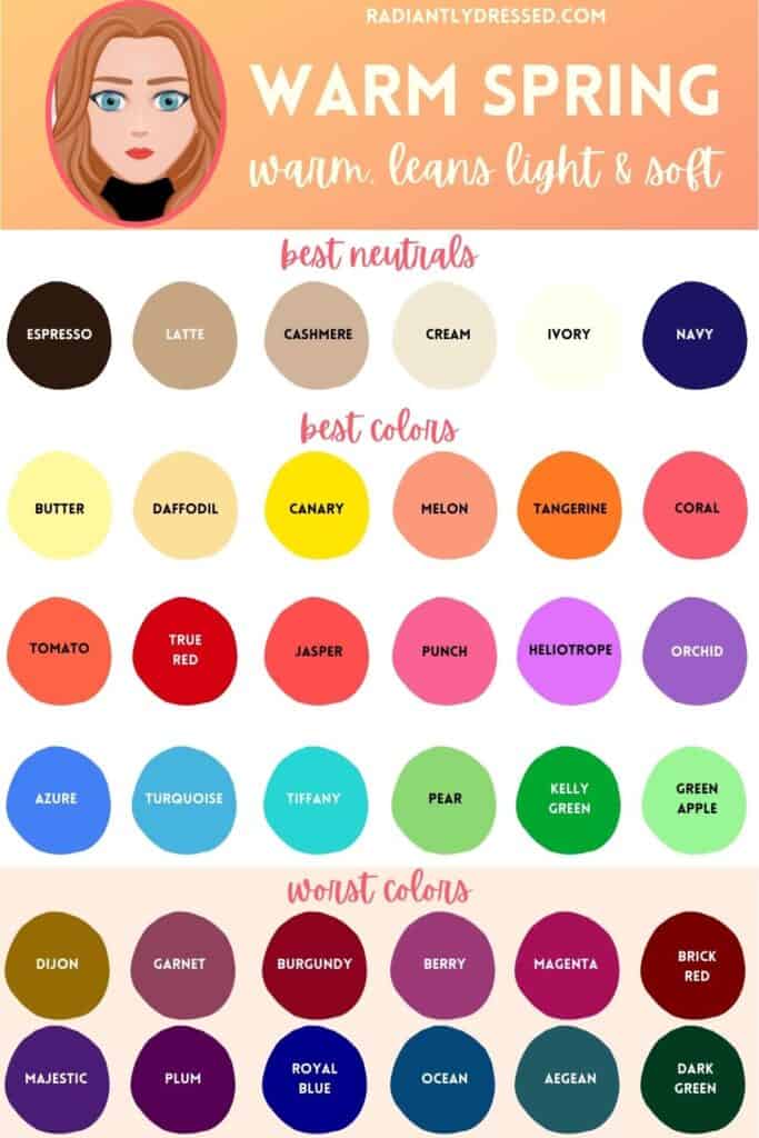
How Do I Build a Warm Spring Capsule Wardrobe? Building a Warm Spring capsule wardrobe is a streamlined process when you focus on your season’s best colors. Start with your neutrals like navy, beige, and ivory which will serve as the foundation of your wardrobe. Then, add in your main color and 2-3 accent colors from the Warm Spring palette. Colors like teal, sunflower, or coral work well.
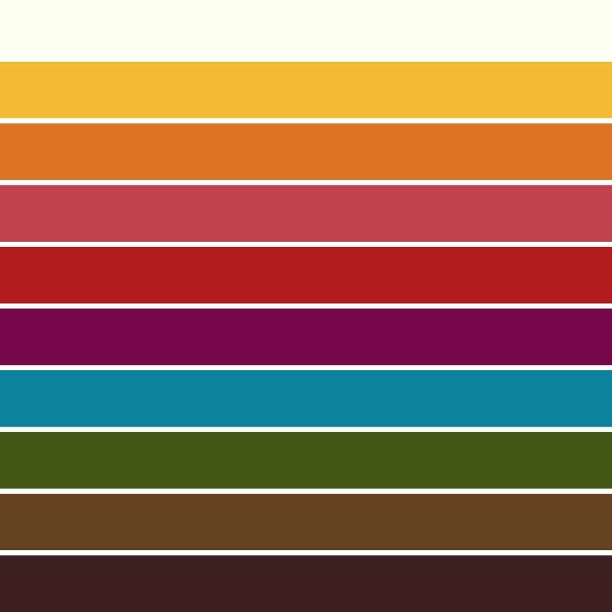
Here’s a simple guide to create a color palette include:
- Base Colors: Latte or sepia
- Dark Neutral: Navy or Espresso
- Light Neutral: Ivory or soft white
- Main Color: Choose one from red or teal
- Accent Colors: Pick 2-3 from your palette, like yellow, green, or pink
Can I only wear these colors?
No way! You should wear what you love! If you want to wear lavender, then go for it! You may find, however, that learning your season affects how other colors make you feel. If you feel confident rocking a color, then it’s yours to own. But if you don’t, feel free to leave it to the seasons that wear it well. If you’re looking to expand your palette, you can also consider sister seasons.
The following are sister seasons for warm spring:
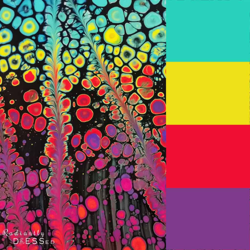
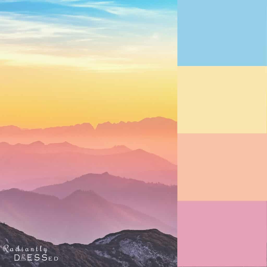
Warm Spring Colors for the Whole Year
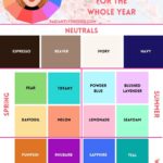
When borrowing from other seasons, it’s helpful to consider those that share attributes. Many women like to choose colors that help them feel in touch with the calendar season, like mustard in the fall. For Warm Spring, the following borrowing recommendations work across the whole year.
In Spring, stick with any colors in the three spring seasons.
In Summer, borrow colors from light spring to embody the lighter feel of summer.
In Fall, borrow colors from warm autumn to get a toasty feel.
In Winter, borrow from clear spring for slightly deeper colors of the cold season.
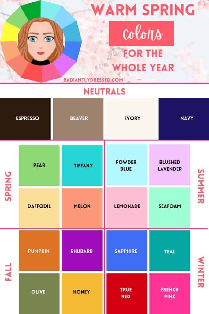
Want to save these graphics for quick access later?
Download the Warm Spring Starter Kit to get the color images featured in this post. You’ll also get a bonus FREE color palette template to make your own colorful closet plan.

Action Steps for Embracing Your Warm Spring Palette
- Identify Your Colors: Start by familiarizing yourself with the Warm Spring color palette. Keep it handy on your phone or print it out for quick reference when shopping. Buy the Warm Spring guide here to go deeper.
- Purge Your Closet: Remove items that are far from your Warm Spring colors or don’t make you feel good. Consider donating or reselling them.
- Invest in Neutrals: Buy wardrobe staples in your best neutral colors like navy, camel, and ivory. These will be the backbone of your wardrobe.
- Choose Your Best Colors: Pick 2-3 signature colors from your Warm Spring palette that you love the most. These will give your capsule wardrobe some variety.
- Plan Your Capsule: Following the 100 Piece Wardrobe Framework, build a capsule wardrobe around your neutrals and accent colors. Aim for versatility and cohesiveness.
- Shop Smart: When shopping for new items, always have your palette in mind. This will save you both time and money in the long run.
- Trial and Adjust: Don’t be afraid to experiment a bit. Wear your new colors and pay attention to the compliments you receive and how you feel in them. Make adjustments as needed.
- Seek Guidance: If you’re struggling to implement your Warm Spring palette, consider seeking professional help. A color analysis session can be a transformative experience.
- Celebrate You: Remember, God made you beautiful in your unique way. Embrace your Warm Spring attributes as a reflection of His creativity.
By following these steps, you’ll be well on your way to simplifying your wardrobe while looking your best, feeling confident, and honoring your uniqueness.
Final Thoughts on Warm Spring
I hope you’ve enjoyed reading about the lovely attributes of warm spring. These individuals are truly beautiful in their vivid bright hues. They can wear primary colors and high-contrast pairings that bring out their lively coloring.
This guide has provided you with information on colors that work well with your skin tone, makeup that brings out your best features, and tips for assembling a capsule wardrobe that suits your warm spring qualities.
Are you a Warm Spring? If so, say hello in the comments!
Related Color Analysis Articles:
Warm spring sits on the cusp of spring and autumn and leans light and soft.
Stacey is the owner and creator behind Radiantly Dressed. She is a certified image consultant and AICI member focusing on creating simplicity in wardrobes via color and style.






Hello!
I had some colour analysises done years ago. At my very first IRL colour analysis I was called “warm spring”. Got my pallette only to find it not that good, wasn’t fond of the bright greens or the more light and dull Stone/pewter etc. Later I was called autumn in another IRL analysis, at that time my dyed hair was covered, unlike at the time when I was called “warm spring”. Felt ok with the warm colours but missed some of the lighter shades actually… People tend to see me as light and warm so recently I have been wondering if the first consultant could have been right even though she didn’t cover My hair… Still confused.
Hey Victoria! So the first thing to note is there are different methods and schools when it comes to color analysis. Plus you have to consider that every analyst is going to have their own perception. We try to be as objective as possible and follow the color, but each analyst is as good as the analysis they’re doing that day. At least you know you are warm, which is half the battle! The hair is the least important feature in color analysis, so you might take a look at light spring if you like the light and warm colors!
So i had a color analysis throigh internet and beem told i am autumn (no sub categories), said i am warm, soft and bright,now i wonder ifi am spring?
Hey Karlie!! It’s unusual you were told soft and bright, since those two things are completely opposite! Soft is autumn, and bright is spring! You might want to explore whether the dark colors of autumn feel better than the light colors of spring.
I am a warm spring. I have a straight body type and I’m petite with the majority of my body being above the crotch. I have found readin web sites and books incredibly helpful. As a blind person I understand what colors should look good but my frustration is finding stores which have my size, style and colors. I have recently moved from Florida to Oregon so I am updating and changing my wardrobe to better fit this climate. In addition I have retired and no longer want suits. I am beginning to turn to the casual dress so that I can dress up and dress down easily. I’m not fond of the shorter pants legs, and the like preferring more traditional styles which are classic but a little sporty. I love tactile details but nothing too garrish. How do I find the right stores with my style in the petite plus size?
Hi Joy! Some of my favorite retailers that carry Petite Plus and fit your wants are Talbots and Land’s End. Both carry classic styles and typically have some that are more sporty as well. Hope this helps!
I absolutely loved this content. I was color analysed last year and I was diagnosed as a Warm Spring and it makes perfect sense. This past Winter I needed a new overcoat and, being a guy, I would have gone out and made my life easy by purchasing the always handy and trusty black overcoat. Not this time: I walked in, found a golden brown (Sienna brown to be exact) overcoat, put it on and immediately a complete stranger looks at me and says ‘wow, only YOU can wear that color!’ I used to go shopping but now knowing my colours has made my shopping experience so much easier!
That’s a great find! Menswear is typically black, gray, or navy! Glad you found a great color for such a useful piece!
How does turning light silver/gold as I age affect my colors. I used to say that I wore colors that stopped school buses. Oranges, lime green, Chinese red…. Now I wear taupe with gold jewelry and silver with amber. My eyes are blue with gold around the iris.
Hey Kate, it really depends on your chroma to start and how it changes. If your hair stays high contrast then your colors will remain, if it becomes more muted you may have to slide into light spring a bit more.
How do freckles impact the color analysis process?
Hi Lisa, they really don’t. Freckles can occur in any season on any skin tone 🙂
Hi Stacey! Love your website but I’m a little confused, couple of weeks ago I was told I’m warm spring, I’m hispanic with warm medium skin tone (neutral or golden undertones not olive), I have hazel eyes and my natural hair color is black… I was researching about it and I don’t think I can be a warm spring with those can I?
Hi Tamara,
I have learned not to discount any possibility when it comes to season. It would depend on what your analyst saw, their proficiency and bias. Spring is rather high contrast so if yours is there it’s certainly an option!
Stacey
Hi, I was considered a spring about 25 yrs ago. I have rosacea now so the skin on my face is always red. I have to cover it up with a yellow based concealer. My eyes r a dark gray, dark greenish with a little yellow. I wasn’t considered a WARM spring 25 yrs ago. My veins r more green. Do I still sound like a WARM spring, especially with my red rosacea face? Thanks
Hey Elizabeth,
Yellow in the eyes is a spring indicator. It’s likely you are still the same season.
Thanks a lot! This blog is amaizing)))
Hi Stacey,
Love your site!! I was recently typed as a Warm Spring and I am enjoying refreshing my wardrobe. My question is this: as fall comes on (I know it’s a ways off!), what colors would you suggest I focus on that fit the fall season? I know there are probably colors that better highlight autumn than others and I’ve always rnjoyed dressing for the seasons.:). Thanks in advance for any advice you can offer!
I’m a warm spring and I love those colors. Thank you for giving me the push to lean into ivory and brown rather than black and white. My mom was an autumn and I have a photo of her in an lbd which she sewed a brown wide sparkly trim piece around the crew neck collar. It went with her brown mink stole. That has always been a visual of how to take a classic and make it personal.